Sundance Brand Story
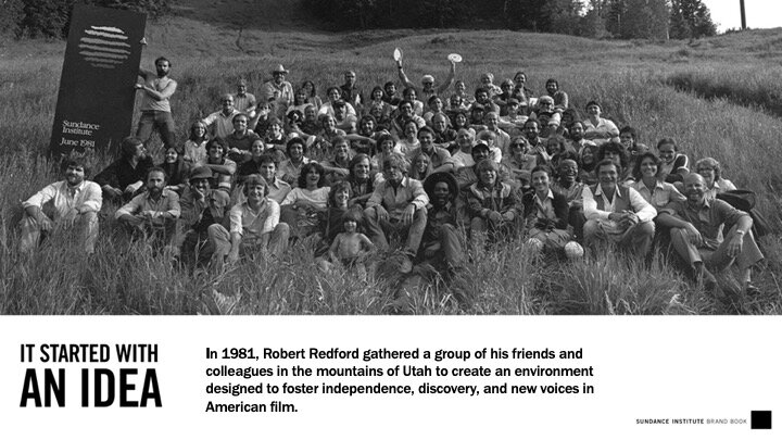
On his land in the mountains of Utah, Robert Redford founded Sundance Institute in 1981. As a nonprofit organization, the Institute provides resources to independent film and media artists, and introduces audiences to their work through a range of public programs including the Sundance Film Festival.
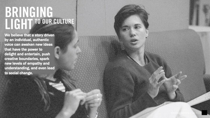
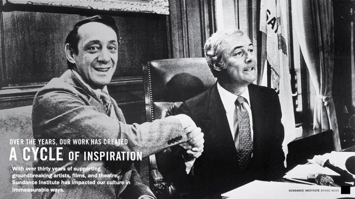
As the Institute expanded into digital and global markets, I partnered with Mr. Redford and Institute leadership to create an infrastructure for the brand. We created a narrative rooted in the founding values and contemporary impact. A brand architecture connected each of the Institute’s programs to its mission, and clarified its offerings for target audiences. The graphic identity was refreshed to convey a bold and unified brand while also allowing for a high degree of adaptability.
Together, this work solidified the Institute’s position as a dynamic, innovative force for individual voice and independent stories, and provided a foundation for unprecedented growth.
Connecting the Dots
The foundational thinking for the new brand story was outlined in an internal deck. We worked with the agency Troika to craft the narrative and apply it to key materials.




Brand Film
As an organization dedicated to independent media, telling the Institute’s story required a brand film. In collaboration with the team at Wondros, we created a 6-minute piece comprised of new interviews, archival material, and film clips to demonstrate the big ideas driving Sundance, why its work is important, and the transformative role it plays in culture.
Refreshed Graphics
A new graphic identity needed to balance the brand’s timeless character with a contemporary aesthetic and a high level of adaptability. Designed to be bold, iconic and memorable, the system features a bright yellow logo complemented by variations in mustard and warm orange. The palette and typography, along with patterns and archival imagery ensure that the system applies to digital, print, and experiential executions, and that it meets the full scope of the Institute’s needs. The graphics and system were designed by Paula Sher of Pentagram.
Institute Brochure
The new branding provided the framework for consumer-facing collateral, including an Institute brochure.
Annual Report
The Institute’s first-ever Annual Report reflected the new positioning and conveyed the year’s wide range of activities for donors and other key stakeholders. Selected pages from the 2014 appear below.


Sundance Film Festival
In alignment with our overarching strategy to position the Institute as the presenting organization for a wide variety of programs including the Sundance Film Festival, we applied the new graphic language to the Festival laurels.
We launched the new Institute identity in 2014 with the Sundance Film Festival, expanding upon the primary graphic language to reinforce the relationship between Institute and Festival.


